Bookmarks
- 20 Nov 2025
- 1 Minute to read
- Contributors


- Print
- DarkLight
- PDF
Bookmarks
- Updated on 20 Nov 2025
- 1 Minute to read
- Contributors
- Print
- DarkLight
- PDF
Article summary
Did you find this summary helpful?
Thank you for your feedback!
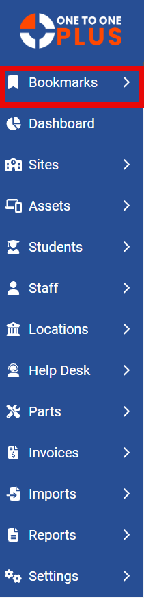
This option allows you to Bookmark your favorite or most frequently used pages. Each person can set up their own bookmarks and easily navigate to the saved pages clicking on the ‘page name’ in the Boomark’s list.
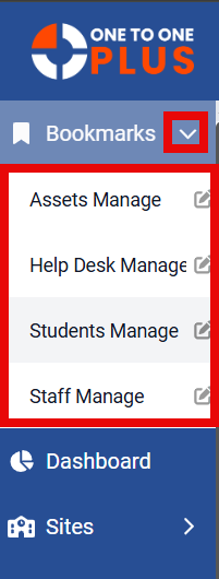
When you click on the arrow (shown in red below) it will expand to show you a list of all the bookmarks that are already saved. To delete a bookmark, you can click on the ‘edit’ icon next to the page name and it opens up an option that allows you to DELETE. You can also navigate to the saved page and click on the bookmark icon to de-select the page. To navigate to a saved page just click on the page name and it will take you to that option.
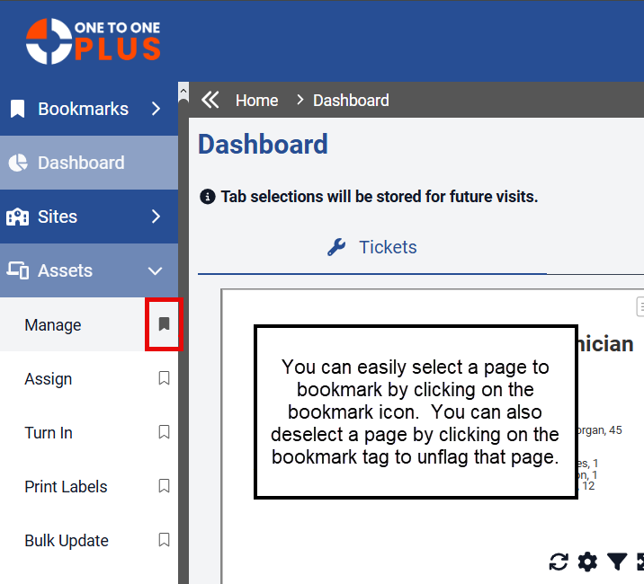
To boomark a page, you will just navigate to that option and click on the bookmark icon next to the page name to save that page in your list.
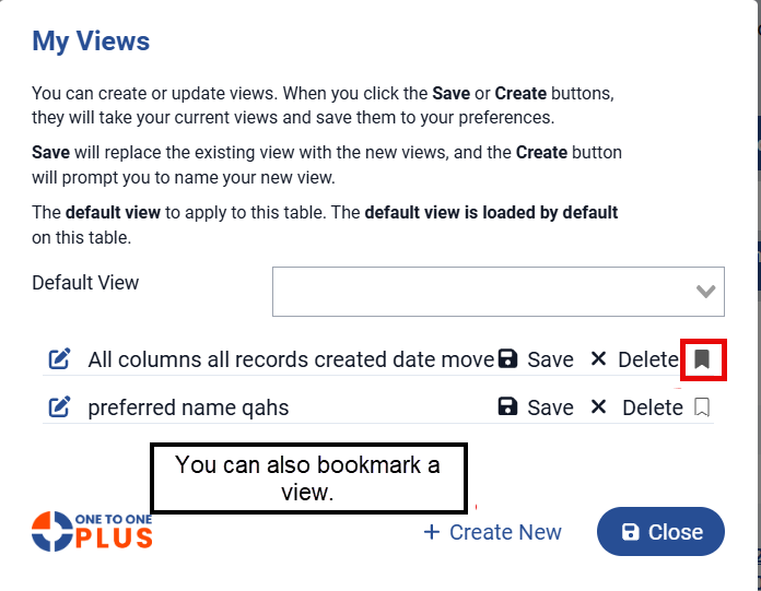
You can also easily book mark a view the same way, navigate to your view and click on the bookmark icon to save as a favorite.
Was this article helpful?